Posts

Rooster

Image
This piece is made from styrofoam. I shaped the styrofoam in the shape of a rooster and coated it with gesso. I then proceeded to paint the rooster with oil paint. I tried to paint as realistically as I could to give it a real life look. I added texture with the feathers and used different values of each color. I used repetition by using the same brush strokes for the feathers. This is definitely one of my more unique pieces. I really enjoyed making this piece.

Down on the Farm

Image
This piece is a picture of my family’s farm. It is taken from higher ground, looking down on the farm. I painted this as a present for my dad for Christmas. I incorporated texture and a variety of colors to help create depth. I used purple in the trees to show the distance and I pulled orange around throughout the picture to help balance the piece. This is one of my favorite pieces I have done, because it is something I know my family will cherish for many years to come.

Lunch at The Country Store

Image
This piece was inspired by my lunch from The Country Store. I used a lot of texture in this piece, especially in the chips to help give it a more real-like look. I also used purple and different values of color, like yellow, in this piece to help add depth. I really enjoyed painting this piece, adding texture and using all the colors was a lot of fun. I had to move a lot of my colors around so my piece would come together and be unified.

Christmas Parade

Image
About two years ago a family friend asked me to paint this piece. He was recently in a car wreck and it reminded me of what he had asked. I started this painting and wanted to add an interesting twist, a hidden bible verse. I also incorporated texture to this piece to help make it stand out and the emphasis is the blue truck. This piece will forever hold a special place in my heart. It was given to a dear friend and is the location of my hometown. 

Pathway

Image
This piece is recreation of Claude Monet’s, “A Pathway in Monet’s Garden at Giverny.” I used oil paints and a pallet knife to create this painting. Using the pallet knife helped apply a lot of texture to this piece and kept the paint thick. It took awhile for it to dry, but once it was dry the texture on the painting was an emphasis of the piece and helped tie it together. There was a lot of greens in this piece, so I had to use different values of green to distinguish between them. A strength of mine was applying texture to the piece, there is some real texture and implied texture. A weakness of mine was choosing which colors to put on the pathway to help show the shadows the trees created. Although there is no personal meaning, I had so much fun creating this piece and enjoyed every minute of it.

Library

Image
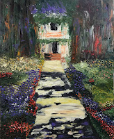
My school recently put on a musical production, Beauty and the Beast. I was able to take part in the creation of the set by creating the library scene. When creating the scene I needed to add tons and tons of books. The goal was to have a massive book case, while creating a magical feel to the scene. Using a variety of vibrant colors helped create a “magical’ scene. I used a lot of orange, blue, and gold. These colors helped build depth in the scene, while creating a happy and magical mood. A strength of mine was portraying a massive book shelf, when I look at it all I see is books and more books. A weakness of mine was using the vibrant colors. I am use to painting more realistic pieces and some of the color choices were out of my comfort zone. For example, painting the floor blue. This piece will always be very close to my heart, due to this movie being mine and my grandmother’s favorite movie. This project was very time consuming, but a lot of fun.

Four Seasons

Image
I created a stepping stone portraying the four seasons. I wanted to create something that would look nice outside through all four seasons, so I created the “Four Seasons”. I cut up different colors that went with winter, spring, summer, and fall. I pieced together a tree in the middle and evenly split the seasons around it. To make the stepping stone interesting I picked different colors of white, green, blue, and orange. I feel like those colors helped portray the different seasons.  One of my strengths in this piece was the variety of color and value. A weakness of mine was cutting the pieces so small. I think it would have been easier if the glass pieces would have been larger. Although, there is no personal meaning behind this piece I really enjoyed the process and seeing the finished product. I would love to create another stepping stone in the future.